![[:::] Waffle Whiffer Zone](https://blogger.googleusercontent.com/img/b/R29vZ2xl/AVvXsEg6dZCYRXloObo9nOsb4WaeCO8i5HyQZYflfDzuASPI6-Ad1wD-5BNilKWFmKGm53W6cR-Gqr22s6uymJZjP5kda1l5ilXC0e2sql-tIYBehNZDUUJZx9Xo3ebTADqHQQM8x0M6tA/s1600-r/wwz-2sm.png)
Packages change, sure -- but I did not expect such a radical change to the iconic, fist-packing little guy we've all come to know and love for over 40 years.
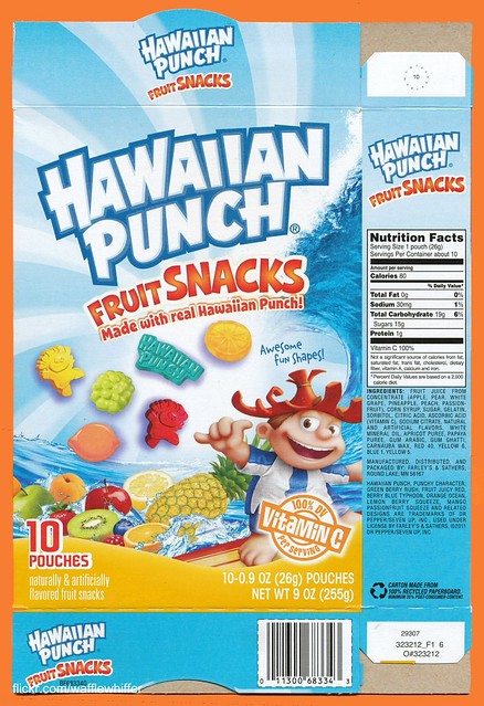
Overall, the new fruit snacks box is pretty sweet looking. I love the colors, the wave and especially the flying gummy bits right there on the box front. You know what you're getting right up front. But the newly designed Punchy just isn't working for me. Gone is the pasty-faced mascot who always packed a wallop, and in comes the computer generated, suntanned version.
The fun, but menacing fist was replaced with the (apparently) more kid-friendly "hang loose" sign. Hmmm...
Well let's dive into the details and read more below. Here's the new style box, again pretty dynamic looking.
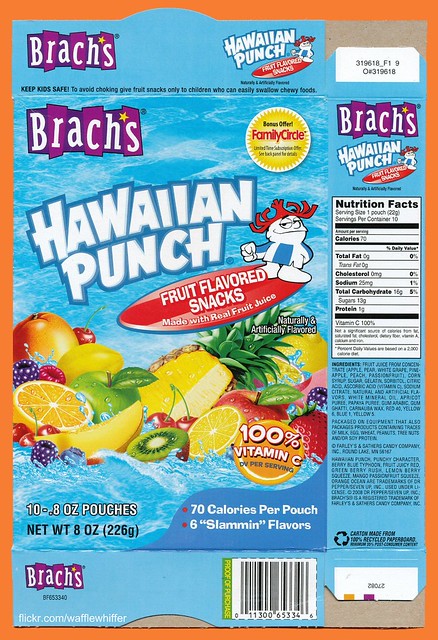
Here's the outgoing box style with the more familiar version of Punchy with his surfboard. Notice the old box includes a Brach's logo. Farley & Sathers was licensed to distribute the fruit snacks and previously co-branded Hawaiian Punch and Brach's. They're still made by the same company, but they've moved away from the Brach's tie-in.
Taking a quick peek over at hawaiianpunch.com, we see that the site is currently closed as of this post, but with a teaser for "New Punchy! Same great taste!"
Apparently we're in for a full-scale makeover of all Hawaiian Punch products, including cans, bottles, drink mixes and fruit snacks.
Getting back to the fruit snacks, comparing the old (left) vs. new (right) boxes, we see that they have also changed the actual shapes of the two Punchy snacks themselves.

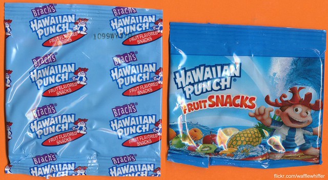
Next, here are the inner snack pouches (old on left, new on right). I prefer the new pouch for the full scene depicted compared to the simple, small, repeated logo on the old one.
So far I've not seen the H-P makeover on any other products, but I'll be watching out for them. Change is good, they say, and I must admit the new box design is beautiful... but the radical Punchy change is a disappointment.
I'll end with a plug. These are some of the best tasting fruit snacks ever! I've tried many different brands, and these are so flavorful!
"How about a nice Hawaiian Punch?" ... Sure, but give me back my old Punchy!
Stan Freberg did the voice for Punchy?!
ReplyDeleteThe update is so wrong on several levels. Give the Oaf who authorized this a Hawaiian punch!
[:::] Mushroom -- I'm not sure on the voice. I've heard Len Maxwell before. Of course it probably changed over time.
ReplyDeletethe new design is hideous. i am so tired of every company copying each other and doing that computer generated 3D airbrushed crap. looks awful. the old design is classic and it is one of the more classic iconic mascot characters IMO. we have lost another great one....
ReplyDeleteyou would think companies would want their products to stick out, but if they all copy each other and have the same horrible style then they just blend in with each other. going to the grocery store and strolling down the snack isle now is like looking at a wall full of designs that were all taken from microsoft's clip art collection.
bleeech
[:::] Brad -- I'll be happy when that trend is over. Look at modern cereal boxes like Cap'n Crunch and Lucky Charms, comparing them to the old days. It's sad.
ReplyDeletebrandon, i think the biggest problem is alot more companies are going to do this because of all the hub bub with 3D movies. it is really too bad.
ReplyDeletethank god companies like Quaker Mills, Doritos, Pepsi, and General Mills throw us a bone with retro flashback designs/reissues.
I found my way here from Branded in the 80s. Very cool idea for a site.
ReplyDeleteI must say that I am a fan of the old school Punchy. The new one looks horrible. But that's the way it always goes, I guess.
Still haven't seen these anywhere. However.. I did see Brach's Hawaiian Punch Jelly Beans at Walgreen's today though. Shoulda bought em' Dangitt!
ReplyDelete[:::] Jason -- Thanks for checking out my site!
ReplyDelete[:::] Darrin -- So far I haven't seen the new Punchy on any other products. I'm sure they're coming soon.
At least he isn't as Alviny as the new Vlasic stork, but I still prefer his original design. But just look at the site now. It's been like that since December!
ReplyDelete